
By thecitysecret Ltd
Introduction
Over the past 20 years trading systems have not changed  radically in terms of appearance, although the amount of available data has greatly increased. There are countless examples of overly-complex, multi-tabbed interfaces each with an array of grids, sub grids, drop-downs, tick boxes and confusing graphs. These are normally accompanied by attention-grabbing, flashing colours indicating where prices are moving.
Financial software engineers are not unique; examples of bad software design are evident across most industry sectors. Pioneers in visual display such as Tufte have made valuable studies and have established good principals for the representation of complex data. Stephen Few, drawing on this work, has evolved these ideas and devised designs around quantitative visualisation and dashboards.
Why Good Design Matters
Despite the fact that eight monitors per desk (common in finance-based offices) deliver a very large amount of “real estate”, once one is used for rolling news, another for email and at least one more for spreadsheets, the amount of space available to view data is smaller than it first appears.
The human eye is very good at picking out data from a spreadsheet and can be trained to spot anomalies. However, a matrix of numbers is not necessarily the best way to represent data; there may be a sizeable chunk which is not important or is very rarely used and when data scrolls off the page it becomes unusable.
Good design helps traders work with a vast amount of changing data and presents it in a way that helps them make sense of the information. In a similar way to using historical charts – a simple and effective way of showing some trends – data can be shown with comparative information to make sense of the patterns of price or volume.
What Is Good Design?
It is worth taking a moment to consider what is good and indeed bad design. Bad design is easier to find and often results in an overly complex screen that is difficult to use. Even in a reasonably well-designed screen there are other factors to consider, such as bad use of space, or displaying columns of data that either contain the same information or that are seldom used, or graphics that poorly represent the data.
There have been many attempts by developers using ‘cool’ widgets such as thermometers and gauges to display information. Some modern graphics libraries offer complex 3D representations that give no clear meaning, or they use graphics with blazes of colour, resulting in displays that are superficially eye-catching but fail to show the data in any meaningful way.
Good design begins with understanding the significance of the data being presented and how that data will be used. This includes understanding the connections between the data. Once that it is established we can apply the principals of Tufte and Few, who advocate an approach of presenting information in a clear and easy to read way and of restricting colours to muted ‘earth’ colours to avoid distracting the eye. The use of graphics is limited to places where they add value and illuminate the relationships between the data that is displayed.
How Is Good Design Applied To Financial Applications?
By applying the basics of good design to applications in the financial markets we can see that the traditional approach of ‘traffic light’-type screens and a mass of grids needs rethinking.
Take the example of a stock; to get an indication of how the market is pricing it in the future we can look at options on the stock. Useful indicators are the volumes of puts versus the volume of calls and their values. The ratio of puts to calls by volume shows whether there is much activity in one direction or the other, and the value ratio shows the aggregated size in monetary terms.
Showing the raw data in a grid would take up valuable screen space. The challenge is then how to represent the significance of the data in a graphic. One approach is to use colour to show the pattern, and in the example in Figure 1 the ratios are shown for both volume and value. It is a small graphic and, whilst the raw totals could have been displayed side by side, the graphic quickly illustrates the ratio between the numbers thus drawing out of the data the significance of the ratios.

figure 1: Put/Call Ratio graphics
The ratio of Put to Call Options by value graphic shows that there is a higher proportion of Calls by value, contrasting with the ratio of Put to Call Options by volume which is more equal. At a glance there is a lot of information given in these two graphics that is easier to see than it would be in a grid of numbers or a conventional chart.
Note the muted circle in Figure 1, which draws the eye to the ratio but does not distract; it is used as an informational alert. This technique can be applied to many of the comparative numbers used in finance – such as stock to sector or stock to index – and also when looking at other ratios such as annualised versus monthly changes.
The use of small graphics to illustrate patterns can also work in grids, as the eye is drawn to the exceptional or ‘out of pattern’ data. Figure 2 show P&L values for a fund broken down by Month, Year and Inception to date. The overview graphics are made up of the percentage changes, and the risk charts are a number of risk parameters shown as percentage changes. The graphics show an overall pattern whilst making exceptions obvious.

Figure 2: A grid showing P&L values with graphics
Another example, based on the Cycle Chart advocated by Few, is illustrated in Figure 3. This example takes 90 days of price data and groups it into the days of the week to see if there is a relationship between days of the week and price movements. The data points are shown graphically and illustrate the variance from the average.
Bar charts are very powerful, making it easy to distinguish between the columns. However, care should be taken in determining the values shown on the axes and we should be prepared to use logarithmic scales when there are big changes in data points.
The examples given illustrate how we can use graphics to highlight the underlying data in a form that can be quickly assimilated visually. The challenge is not only to use graphics where appropriate, but also to use tables and text to give a full and rounded view of the data. There are other intuitive ways of displaying complex data, many of which are explored by Tufte and Few (see further reading).
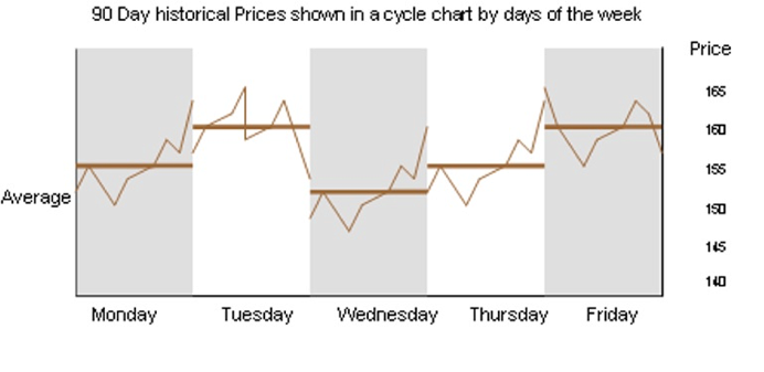
Figure 3: Cycle chart showing 90 days of historic prices
The Pitfalls Of Visualisations
There are a number of traps to be avoided when displaying data, sometimes caused by the limited ‘out of the box’ tools supplied by developers. For example, most toolkits provide Pie Charts, but these are generally best avoided as it is often difficult to understand the differences between segments, and clear labelling becomes problematic if there are lots of small slices. Comparative data is best displayed in either a table, bar chart or, if the spread of differences is tight, a Dot Plot. Maps with pins or colours look pretty but take up a good deal of space and do not add much value on their own.
As already discussed, some of the graphics tools such as gauges, thermometers and the stranger 3D charts should be avoided. While they look good at a first glance it becomes quickly apparent that they are confusing and they take up a good deal of valuable screen space.
Although primary colours are widely used to signal changes in trading screens these too should be avoided, as they have the effect of alerting the eye too frequently. Trends in price movements can be shown using absolute or percentage-change numbers, as well as small graphics such as up and down arrows. The eye should be drawn to exceptions and not distracted by routine updates.
Putting It All Together
The use of clear text, summary grids and graphics all contribute to a better understanding of complex data. Aspects and layouts are also important in displaying information and drawing out the significance of what is being shown.
As important is to ensure that connected data is summarised effectively, with the user having an option to ‘click through’ to the detail behind the summary.
The colour palette should be made up of muted colours, allowing the end-users to focus on the task in hand and not get distracted.
Good Design In Practice
thecitysecret began working on a Hedge Fund Platform, Hārchvärd, a number of years ago. One of the key objectives in building the platform was to create an easy to use, intuitive desktop application. Navigation is by means of functions grouped into logical boxes, each function opens a tab allowing quick switching between views.
Information is displayed in a number of ways. Where it makes sense, grids are used and then enhanced by using small graphics. The right hand panel in Figure 4 is used to display small graphics, showing the related ‘peripheral’ data and helping the user build a more complete picture of the instrument displayed.
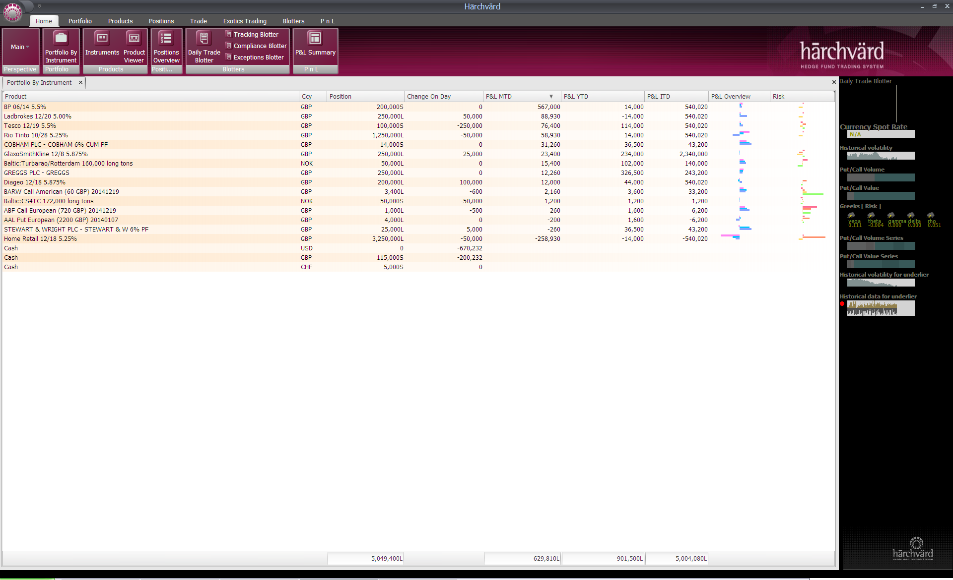
Figure 4: Portfolio view (click on image to see larger version)
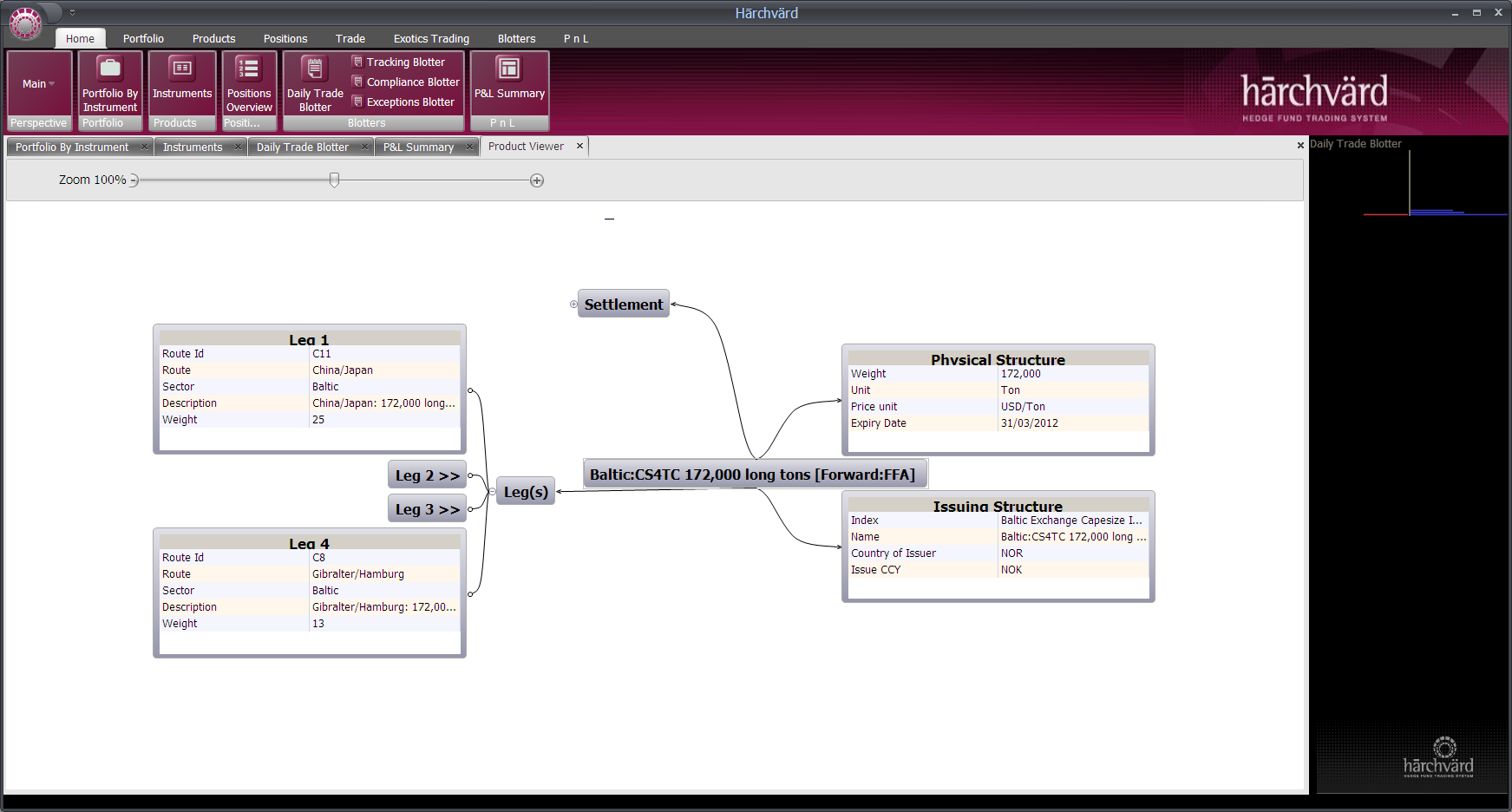
Figure 5: Product Viewer (click on image to see larger version)
In representing complex data, such as the Freight Forward termsheet shown in Figure 5, an approach was taken to group the data and display the most relevant information. In this way the product could be quickly reviewed at a glance, whilst maintaining the links to the associated grouped data. Work is ongoing to enhance the user experience. We continue to develop new ways of representing information, by drawing out the significance of the data and its connection to related data, building on the good design practices set out by Tufte and Few.
Further Reading
• Information Dashboard Design, Stephen Few, O’Reilly, 2006
• The Visual Display of Quantitative Information, Edward R Tufte, Graphics Press, Second Edition, 2007
• Now you see it: Simple Visualization Techniques for Quantitative Analysis, Stephen Few, Analytics Press, 2009
About thecitysecret ltd
thecitysecret ltd, is an established software engineering and consultancy company working with top tier financial institutions across the financial centres of Geneva, London and Moscow. Their flagship product, Hārchvärd is a new Alternatives Platform written from the ground up and are now looking for partners to shape its’ direction. To learn more visit http://www.thecitysecret.com/products.html or the Hārchvärd YouTube channel http://www.youtube.com/user/Harchvard
THIS ARTICLE HAS BEEN SPONSORED BY thecitysecret ltd.
Related Article: Are Hedge Fund Managers with More Than Two Screens More Productive? (Aug 2013)